

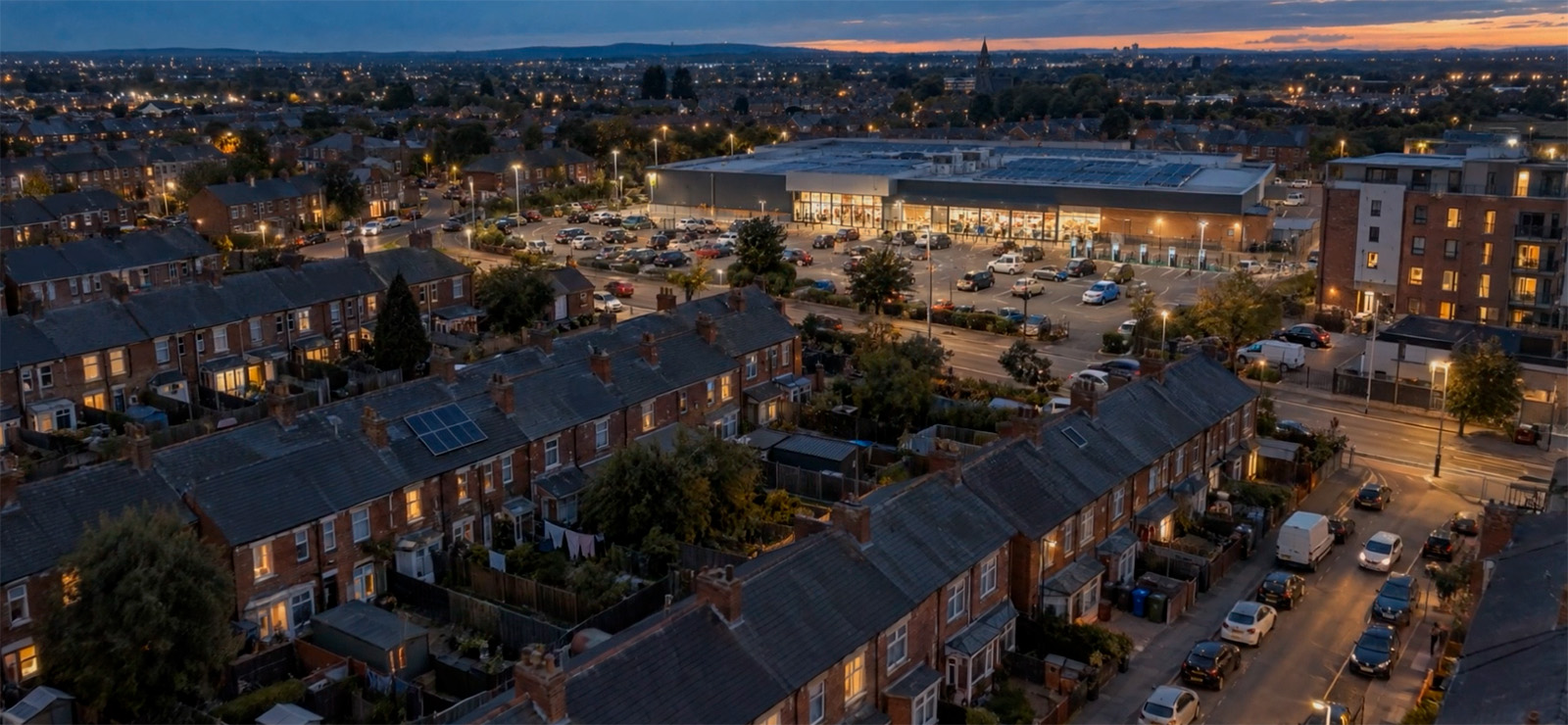
We have worked with Worldpanel by Numerator for fifteen years. It is a client we know very well.
At the beginning of September, they came to us with a new brief. They were hosting How Britain Shops: Then · Now · Next, a one-day event at the Design Museum in London. The audience was senior people from across FMCG and retail: category, insights, marketing and commercial leaders. Some were long-standing clients. Some were prospects meeting Worldpanel for the first time.
The event also had a job to do. Worldpanel was announcing the biggest change to its GB panel in years: from 30,000 to 55,000 households, and around three times the store visits.
Our film was the first thing the room would see. Two minutes to set the tone for the whole day. The brief was clear about what it should not be: “not a corporate showreel or product advert.” It had to feel like the opening of an important story, and move the room from “I remember that” to “I want to see what comes next.”
In a museum of design, in front of that audience, it had to look great.
The challenge
As soon as we read the brief, we fell in love with the project, but we also noticed a challenge. The film started in 1996, so we had to show what shopping in Britain was like at the time. Then the film would move to the present, and on to what comes next.
The present-day part was familiar territory. The 1996 part was not.
For fifteen years, most of the films we have made for Worldpanel have been built with stock footage. We have spent many hours inside stock libraries. The problem was never finding clips. It was what those clips could say. Worldpanel’s work is specific and full of nuance. Stock footage is generic. Too often we ended up with clips that filled the screen but meant nothing visually: people looking at laptops, hands on a keyboard, a busy street. Filler.
For 1996 Britain, stock was not even an option. A specific family, on a specific shopping trip, in a supermarket that looks like 1996 and nowhere else? We did some online research to see what was available. Nothing came close.
So we proposed something new. We would generate the 1996 part of the film with AI. Then we would make the rest with a mix of stock and AI, closer to the work we do for Worldpanel every day.
They said yes. We had three weeks.
This was a challenge for us as well. We already used AI in our productions, a shot here, a fix there. But this was the first film we planned to be almost entirely generated. In the end, every shot but one was made with AI. The voiceover is AI too. The music came from a stock library, and it was exactly right for the film.
The AI video production workflow
The first thing we did was not visual at all. We created a project in Claude and gave it the brief. From then on, Claude worked with us through the whole production, with a separate chat for each job.
One chat was for research. A film set in 1996 needs a lot of small facts to be right. Which cars would be parked outside a supermarket? What was the most common family car? Were shopping bags plastic or paper?
For some projects we write an AV script before anything visual exists. It is a table that describes every shot in words, matched to the line of voiceover it sits under: timing, composition, action, and where each shot comes from. On this film it was essential. In an AI production the storyboard cannot exist until the images exist, and the images cannot exist until every shot is described.
Claude wrote the first version of it in another chat, working from the brief: 58 shots, timed against the voiceover. It was a competent draft, but an average one. It covered everything in the brief, and it had some good ideas. But it lacked originality, and it had no real point of view. That is a useful starting point, but it doesn’t make a film. So we took that draft and made it ours. We rebuilt it, corrected it, cut ideas and added our own, and kept iterating with Claude on our version, until we felt it was right.
We were also clear with the client about what this document was for. For now, AI generation is not an exact science. Some shots would not work, and we would only find out when we tried to make them.
So we asked them to confirm only the decisions that are expensive to change later: the overall structure and the aspect ratios. Everything at shot level stayed open. The real approval would come at the storyboard, with real images to look at.
The order of work was:
- AV script, approved by the client.
- One casting image: the family, the look and the supermarket in a single frame, approved by the client.
- Character sheets and location plates, built from that image.
- Stills: one start frame for every shot.
- Storyboard from those stills, sent with the voiceover and music options, approved by the client.
- Video clips, generated from the approved stills.
- Edit, sound design and grade.
The idea behind this order is simple. Get approval on the cheapest thing that can still be wrong. A casting image costs one generation. Finding out at the storyboard stage that the mother looked too young would have cost fifty.
We also decided to make the 1996 act first, on its own, before touching the rest. It was the hardest part, and it would set the visual standard for everything after it. The rest of the film was closer to what we have done for Worldpanel for fifteen years. If 1996 worked, the rest would follow.
Why three aspect ratios
Every decision in a film should have a reason.
Aspect ratio is one of the tools we have, and on this film we used it to show time.
The event was called Then · Now · Next, so the film has three acts. Each act has its own frame.
Then is 4:3, the shape of a 1990s television.
Now is 16:9, the frame we all watch today.
Next opens up to a wide 21:9.
The audience doesn’t need a caption to know that time has moved. The screen tells them.
The changes happen inside voiceover lines, not between them.
The frame goes from 4:3 to 16:9 on the word “barcodes”, at the exact moment the film moves from the old collection method to modern data capture.
It widens to 21:9 when Worldpanel’s new panel is introduced.
And it opens back to full 16:9 for the final title, so the last thing the film does is make the frame whole.
And everything sits inside a 1920 × 1080 master.
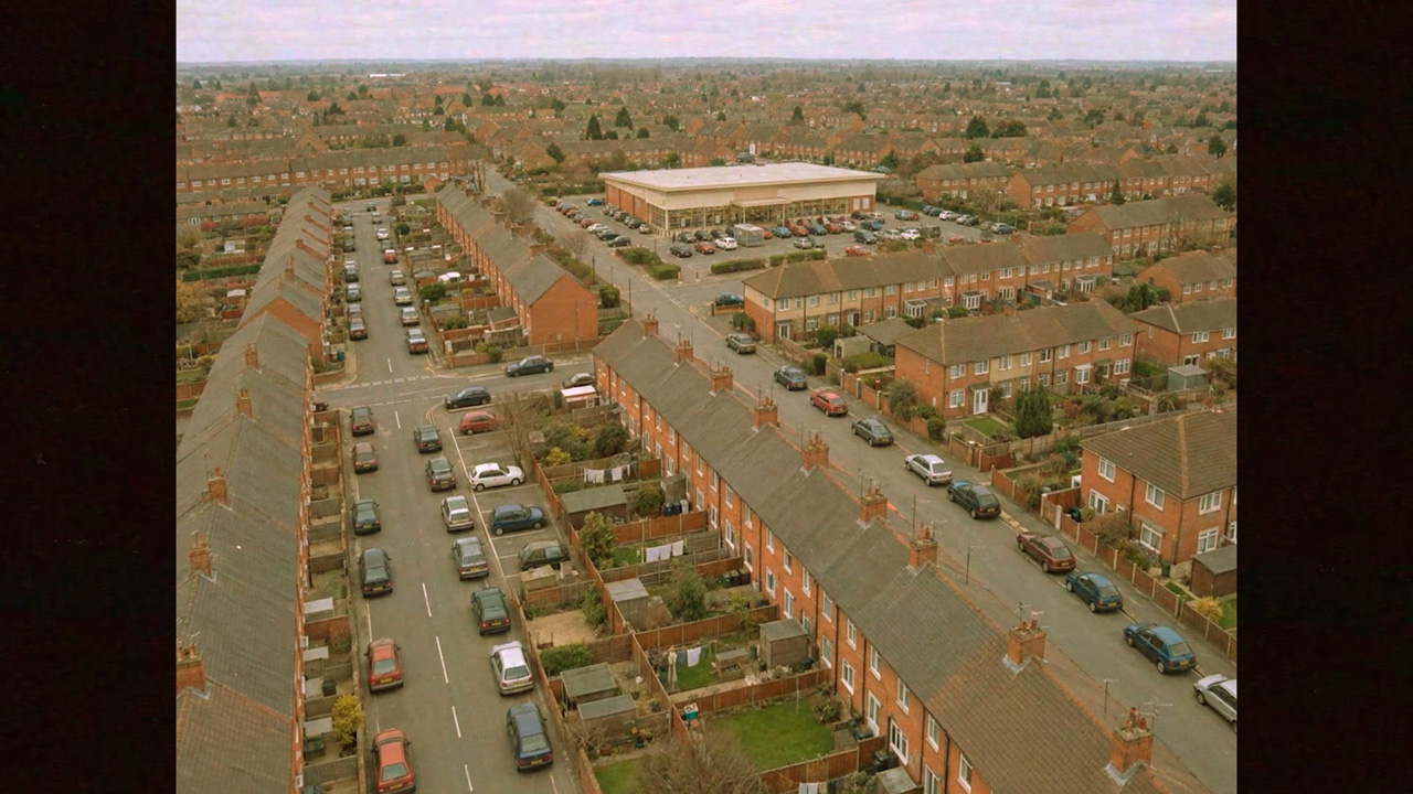
Then
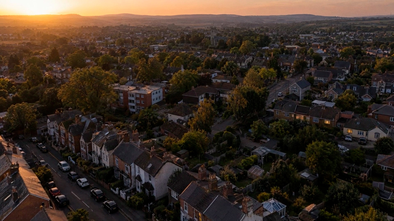
Now
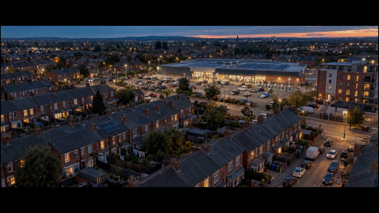
Next
Starting with the hardest part. Britain, 1996
Defining the photography first
Before we generated anything, we decided what kind of photography this film would be. Not the colours or the grade, but the way of looking at people.
Our reference was British social realism: the documentary tradition that shows ordinary people in ordinary places, without making them look better than they are. Think of directors like Ken Loach or Andrea Arnold.
This decision did more work than it seems. An image model has no taste of its own. Left alone, it gives you a polished, flattering, advertising look. A defined photographic style gave us something to describe in every prompt: available light, real rooms, ordinary faces, moments that look caught, not set up. It is what kept fifty shots, made with different models over three weeks, looking like one film.
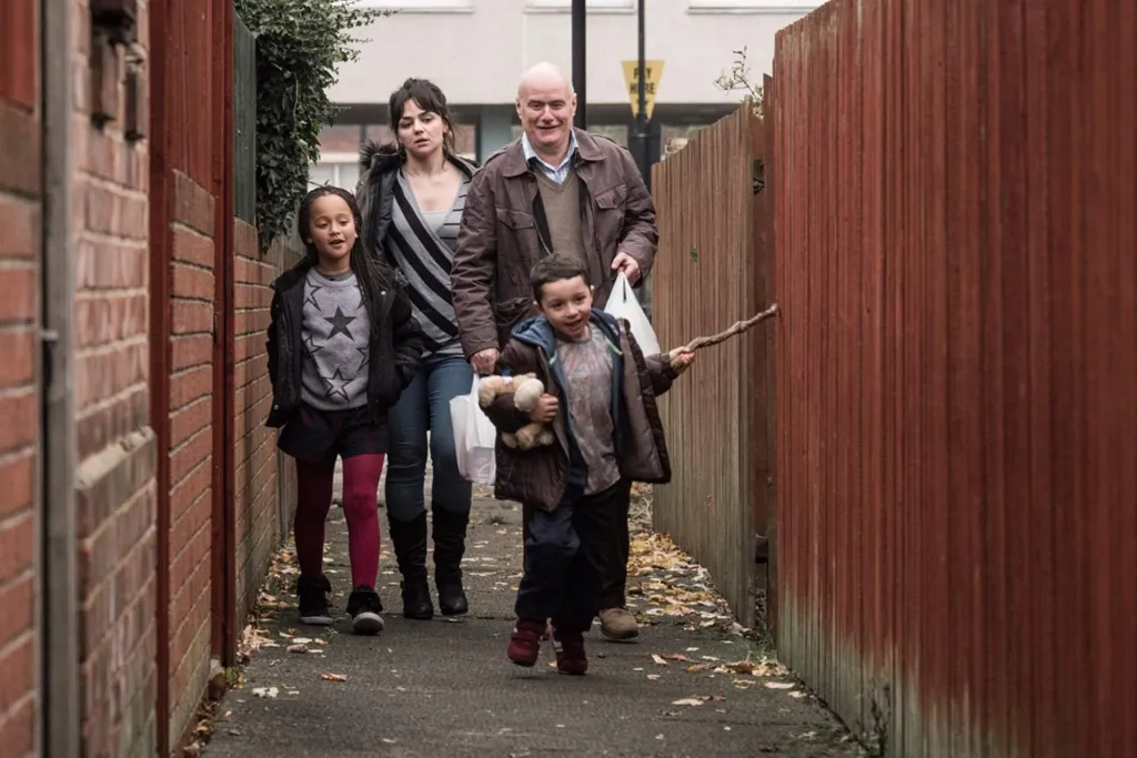
From the film “I, Daniel Blake” by Ken Lach
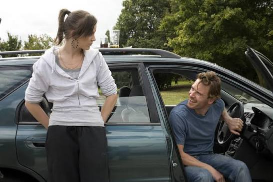
From the film “Fish tank” by Andrea Arnold
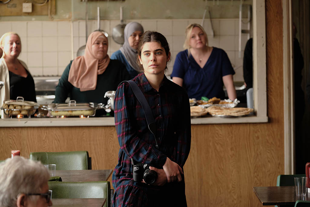
From the film “The old oak” by Ken Lach
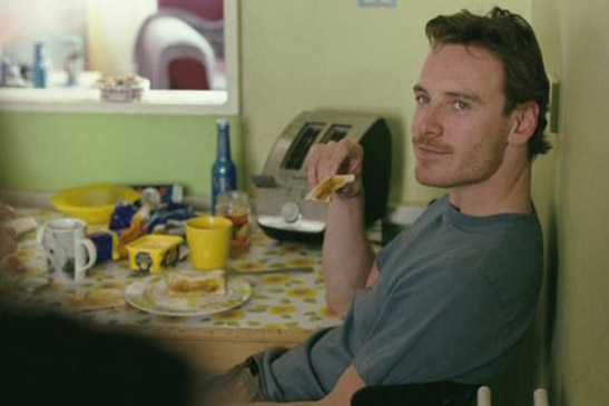
From the film “Fish tank” by Andrea Arnold
One image to start
We started with the cast. The client had a clear view on who should be in the shop:
“I would make it the Mum with 2 or 3 children aged maybe 13, 9 and 4. I’m thinking that it would have been more unusual to see the Mum and Dad and all the children doing the supermarket shop at the same time.”
It was a good observation, and it became the family at the centre of the 1996 act.
Then we made a single image: the family in a supermarket aisle. All four looking straight at camera, still and formal, like a casting photograph.
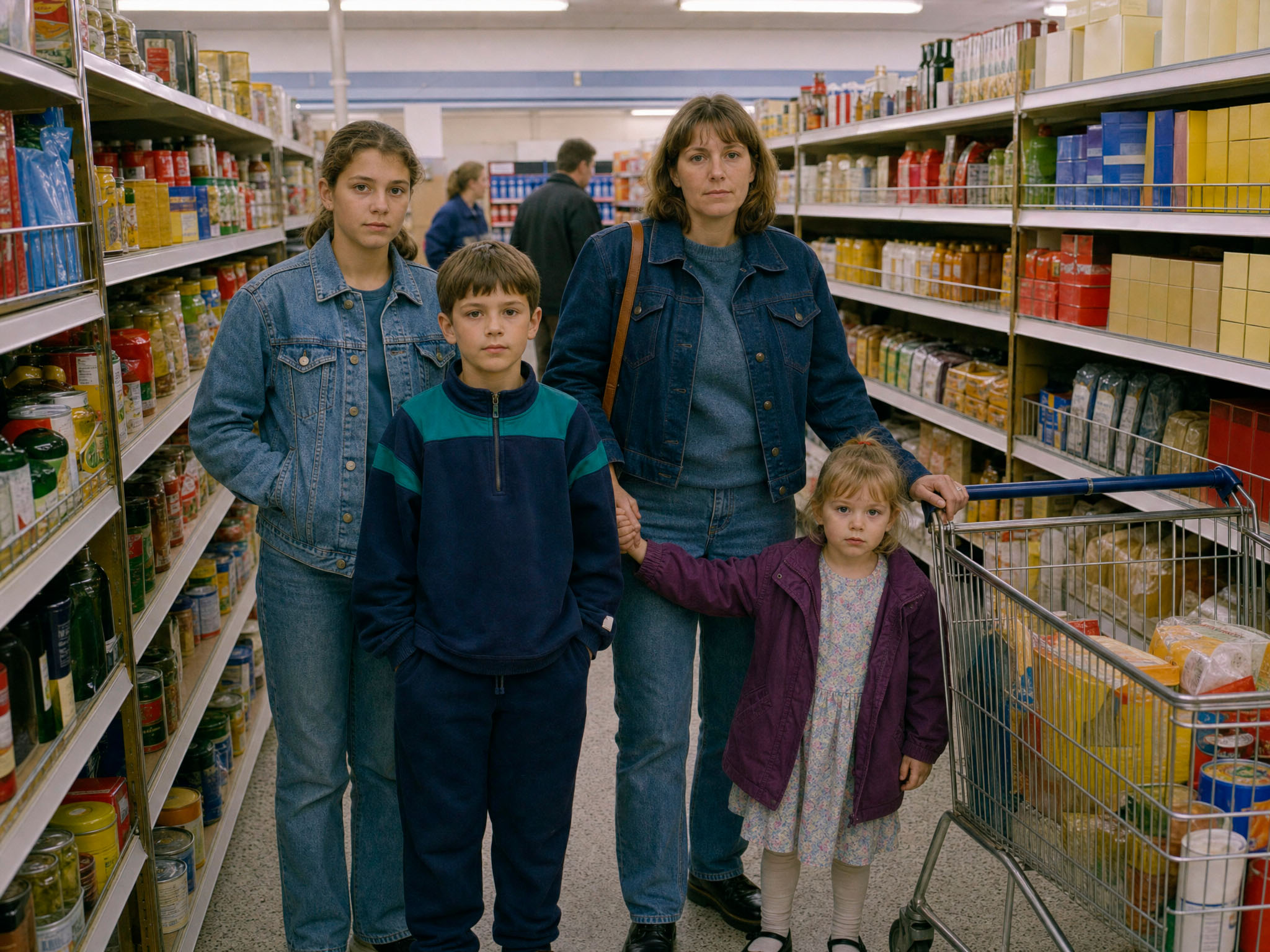
That one image let the client approve three things at once. The look of the film. The cast. And the location. The question was simple: are these the right people, in the right world?
The supermarket was a challenge on its own. It had to have no real brands, no logos and no readable names. But it still had to look like a real British supermarket in 1996. A shop with no branding easily looks fake. Blank packaging looks like something has been removed. So every pack in the film is printed and colourful, but with nothing you can read.
The client approved it, with one comment:
“The family look sad at the moment (LOL) but I know that’s not what they’ll be ‘in action’.”
The expressions were deliberate. They came from the photographic style we had chosen.
Documentary photography doesn’t ask people to smile for the camera. This was meant to be a neutral photograph of a family, not a happy family from a stock library.
The model was doing exactly what we asked. The expressions and the life would come later, in the video generation, when the family started to move, talk and react to each other.
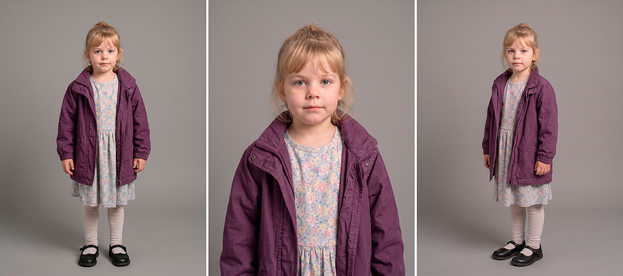
Character sheets: one person, many shots
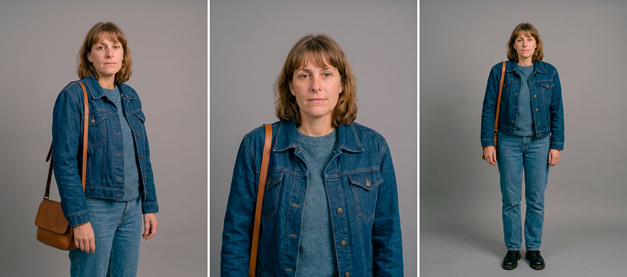
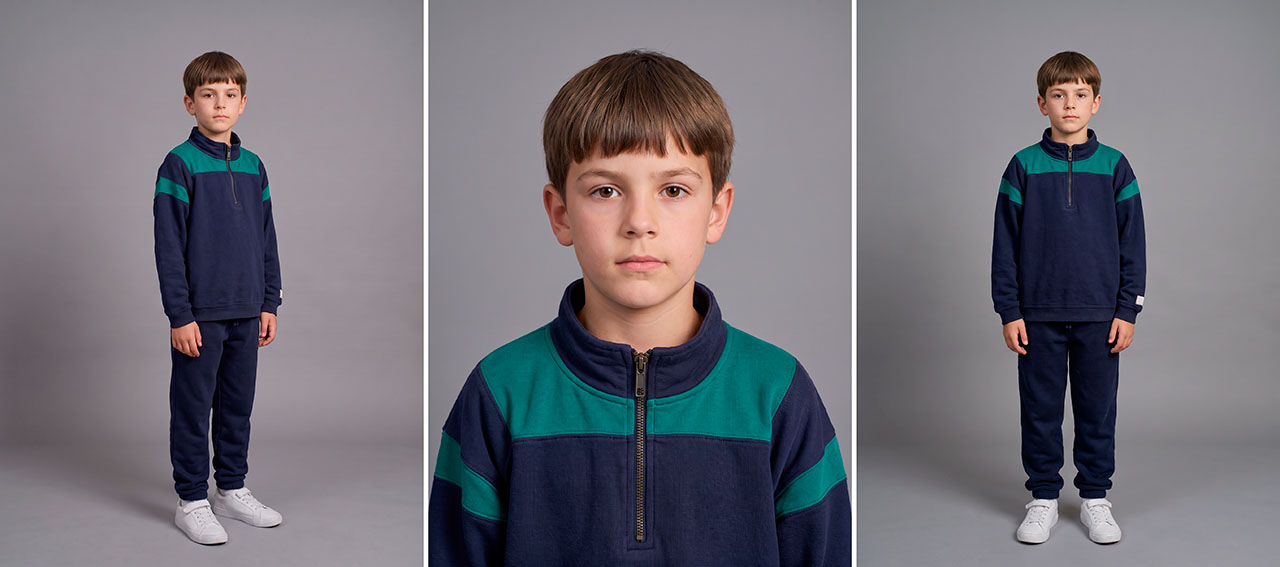
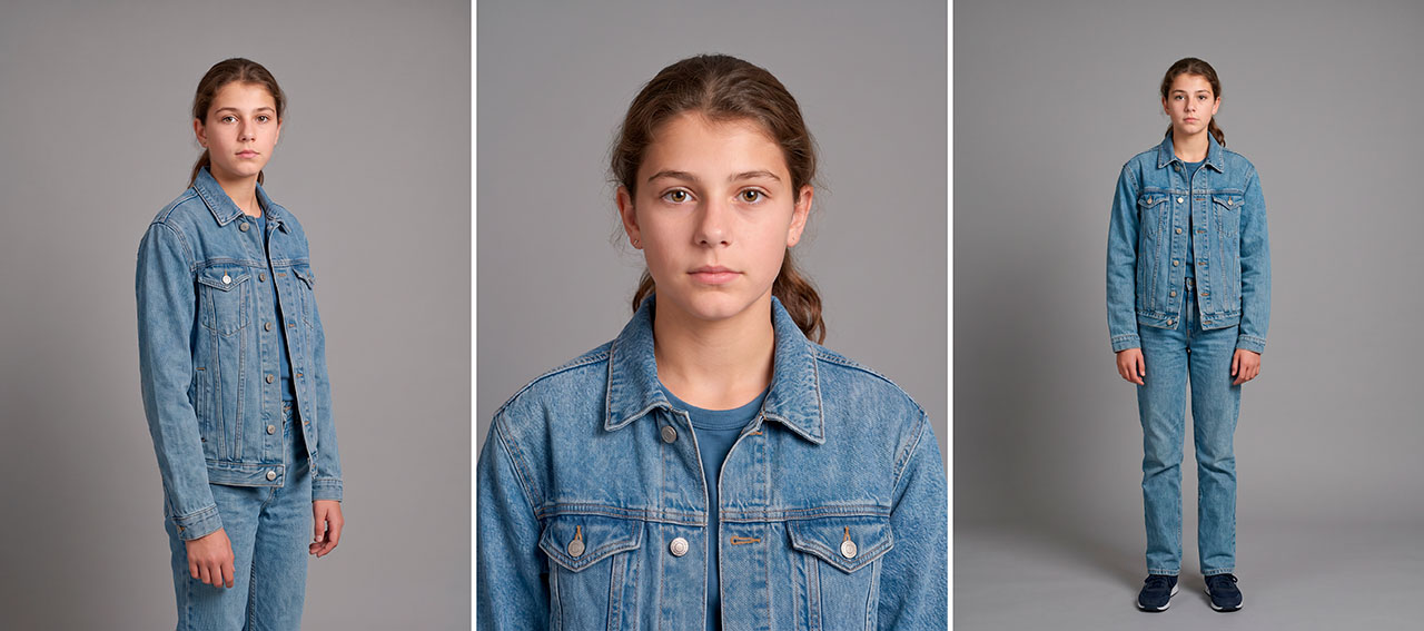
Four people appear in several shots of the 1996 act. Image models don’t remember people between generations. Without a reference, the mother in shot 2 and the mother in shot 14 are two different women.
So we built a character sheet for each of them, cropping each person from the casting image. Each character got three separate full-frame images: full length, three-quarter, and head and shoulders. And we fixed every item of clothing, because at a distance clothing is what makes a person recognisable.
These sheets then went into every still as references, and into every clip.
Locations
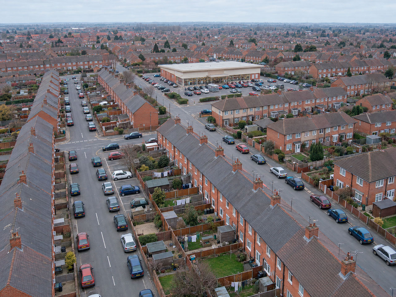
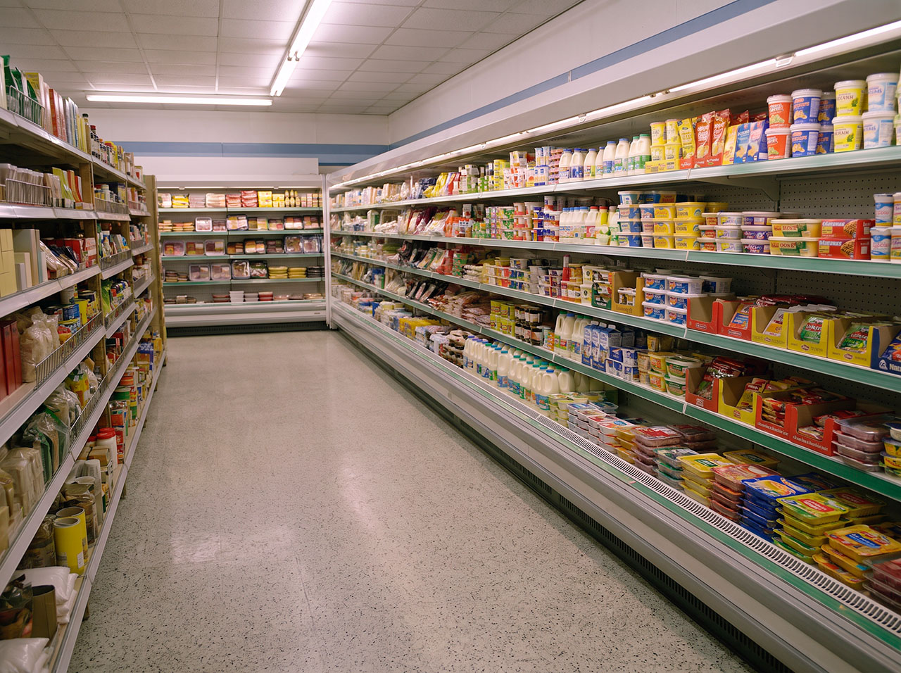
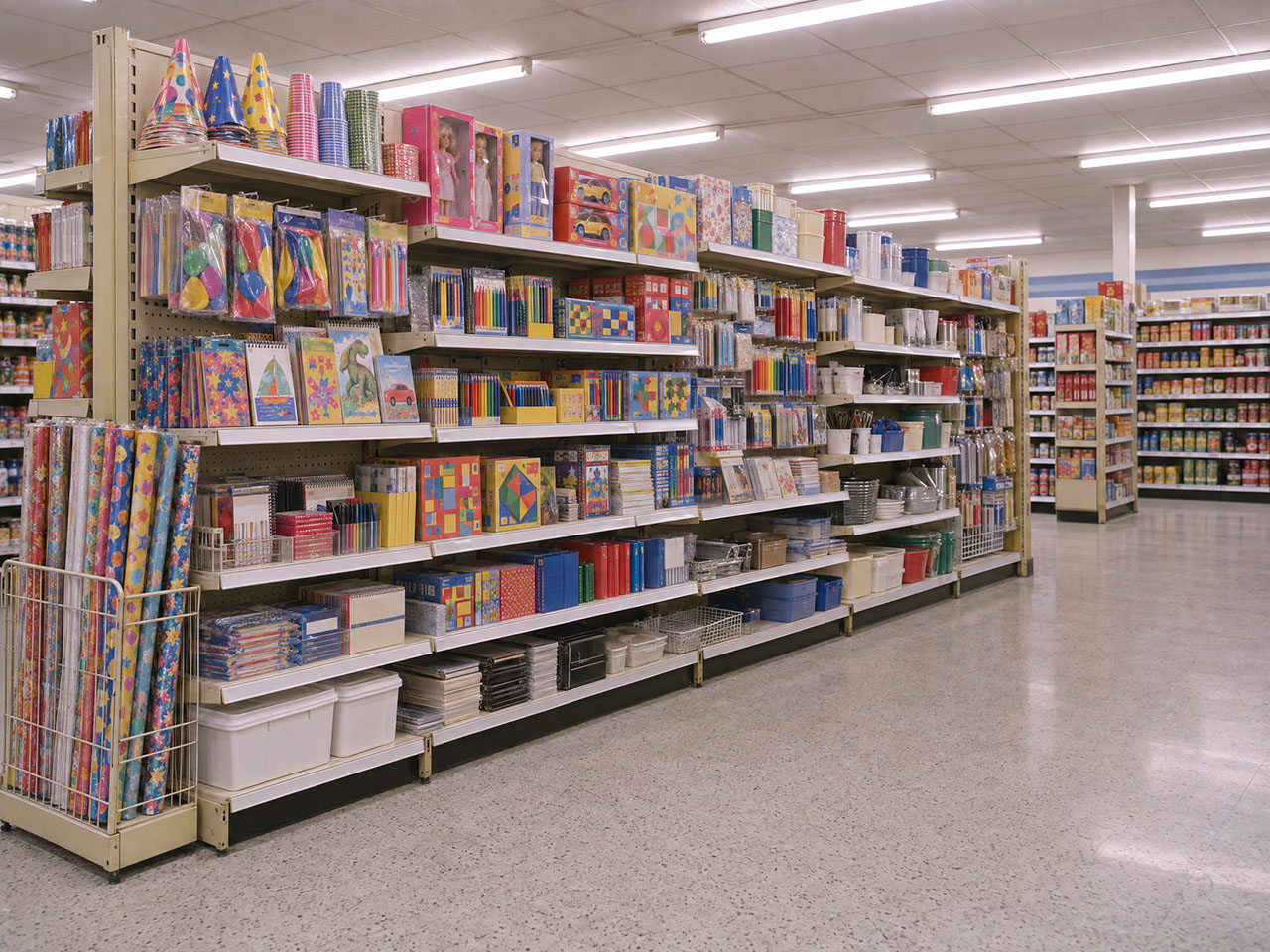
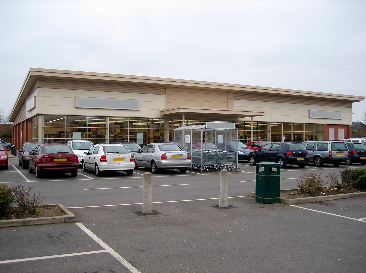
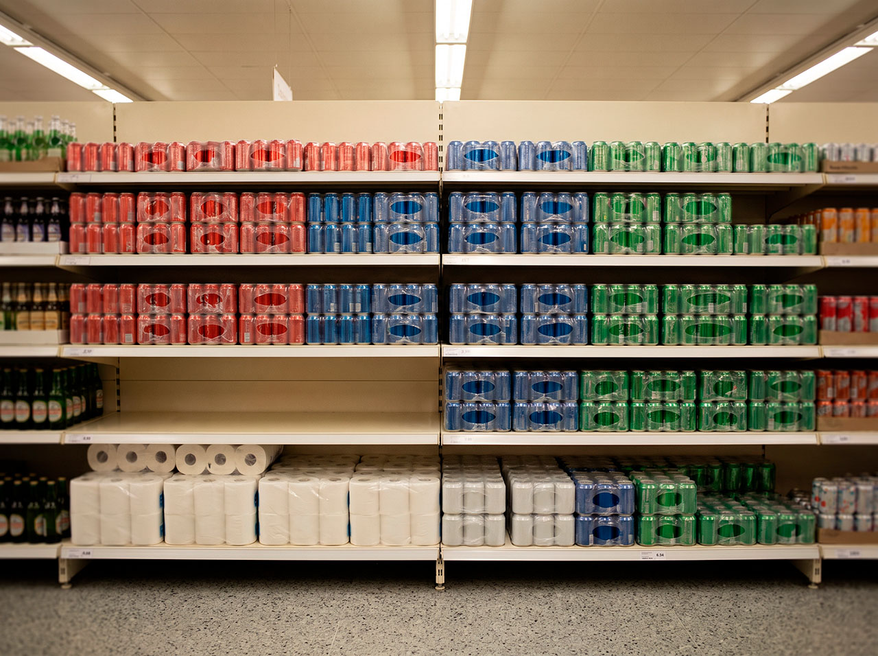
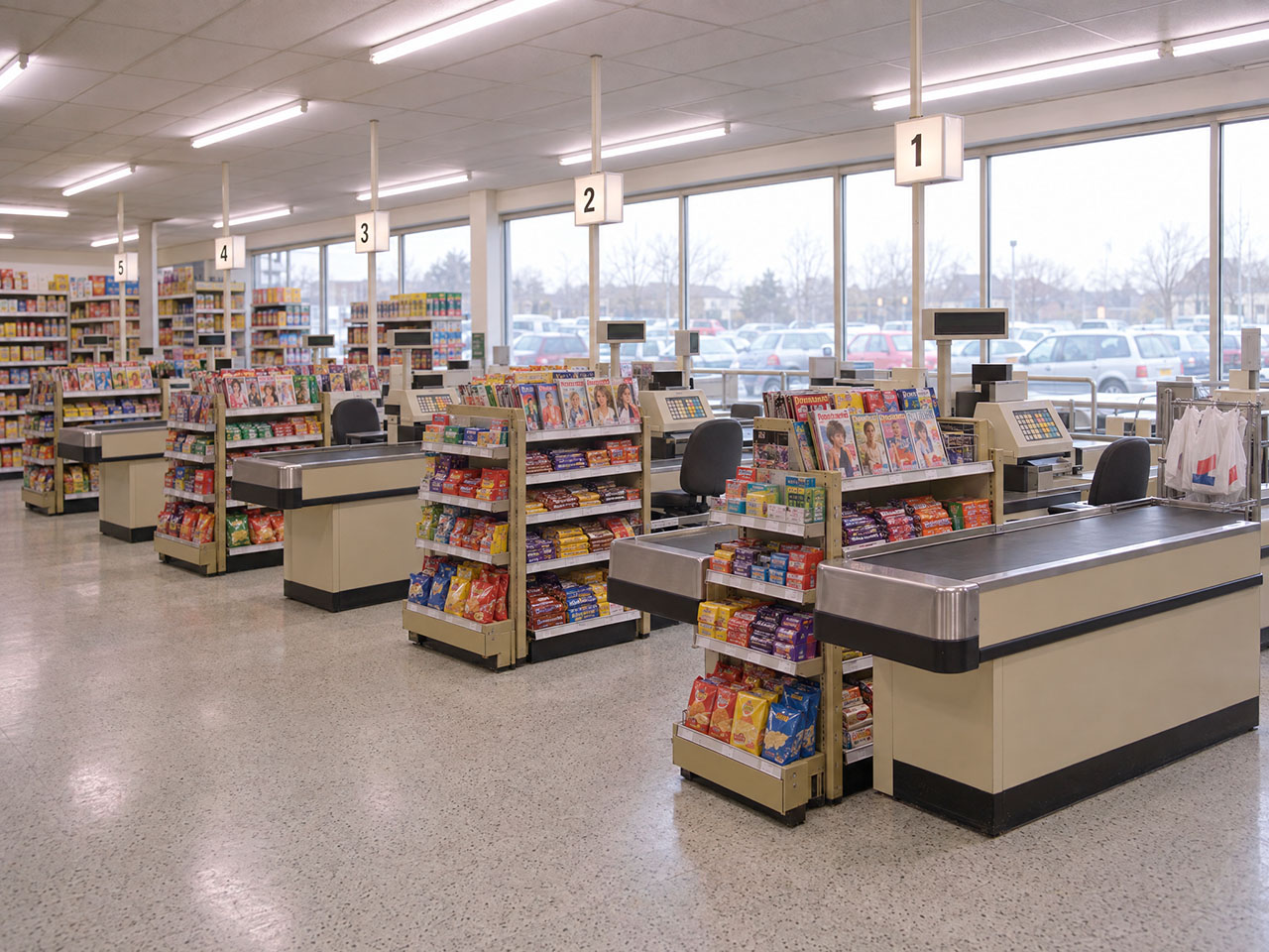
We did the same with places. We built reusable plates: the aisle, the shelves, the checkout, the car park, even the trolley. A plate carries the style of a place: the shelving, the floor, the ceiling height, the quality of the light. Each shot then builds on it, so the whole act feels like one shop instead of twenty.
The exterior needed the most care. Four shots share the same building: the aerial, the arrival, the entrance and the return to the car. Generated separately, that is four different supermarkets.
The storyboard, and the sound
With the cast, the places and the style approved, we generated a still for every shot in the 1996 act. Those stills became the storyboard.
We sent the storyboard with something else: the voiceover over four different music tracks.
The brief was specific about sound. It asked for a warm, assured British voice, “conversational and observant, not ‘voice of God’ or sales-led.”
We generated the voiceover in ElevenLabs with several voices that matched that description. One of them was right as soon as we heard it.
Then we chose four tracks from a music library, mixed each one with the voice, and sent all four. The client chose one straight away, and it stayed until the end.
The tools
Claude: from idea to prompt
Claude was the tool we used most on this film. Research and the AV script were part of it. But prompting is where it made the biggest difference.
Image and video models need very specific language. A prompt for a still has a structure: the scene, the reference images, the camera, the light, the capture, and what to leave out. A prompt for video is the opposite: short, with one action, one camera move, and a note on what must stay stable. Getting this right for every shot, and keeping it consistent across fifty shots, is hard.
Claude worked as a translator between our ideas and the prompts. We explained what we wanted to see, in our own words. Claude wrote the prompt. We generated the image and showed Claude the result. Sometimes we were happy with the first one. Other times we kept iterating until we got what we were looking for. Then we did the same for the video prompts. We gave Claude the still and asked for the video prompt, describing what we wanted. We could not have written prompts at this level on our own, and certainly not this consistently.
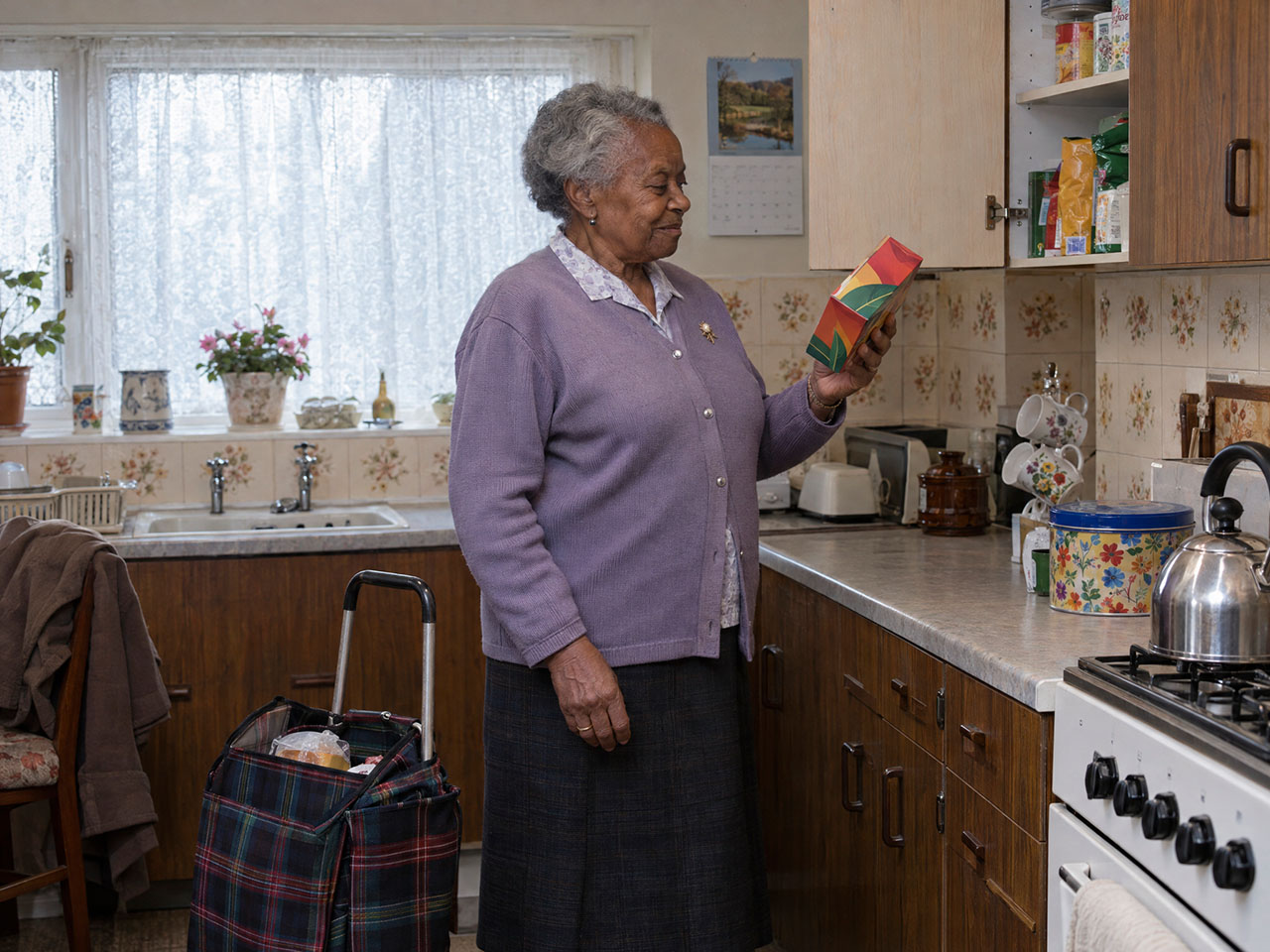
A documentary photograph in a British kitchen in 1996.
SCENE
A woman in her seventies stands at the kitchen worktop, facing towards the right of the frame. Beside her on the floor stands a two-wheeled tartan shopping trolley, its top open. She has just taken a box of tea out of the trolley and holds it in one hand, raised in front of her, looking at it with a small private pleased smile — her own tea, the thing she always buys.
Above the worktop to her right, one wall cupboard door stands open, its shelves visible inside, half full of tins and packets. She is about to put the tea away.
THE WOMAN
A black woman in her mid-seventies. Short grey hair, neatly set. A lined, ordinary face, no makeup, warm and unremarkable. Small build, slightly stooped. She wears a buttoned cardigan over a blouse and a skirt. A wedding ring and a small brooch. Her coat is hung over a chair behind her.
THE TROLLEY
A 1990s two-wheeled shopping trolley: a fabric bag in a dark tartan check on a metal frame with a long handle and two small wheels, standing upright on the kitchen floor, its top flap open with a few groceries still inside. No brand name, no wordmark, no logo.
THE TEA
A plain rectangular cardboard box of tea bags in a simple flat colour, with an invented generic design and no readable text or logo.
THE FRAMING
Seen from the side. The kitchen worktop runs along the right of the frame, against the wall, with the wall units above it and one cupboard door open. The woman stands in the middle of the frame, facing right. The shopping trolley stands on the floor beside her, towards the left. Nothing stands between the camera and the woman — no island, no peninsula, no table.
THE KITCHEN
A small older British kitchen: dark wood-effect units with plain handles, a worn laminate worktop, a ceramic sink under a window with patterned net curtains, floral wall tiles, a whistling kettle on a gas hob, a biscuit tin, a calendar on the wall with no readable print. Tidy and dated, warm and well kept.
CAMERA
Chest height, square on to the side of the kitchen. Medium full shot — the woman is framed from just above the knees upwards, with headroom above her, and the top of the shopping trolley visible at the bottom of frame. She is positioned in the middle of the frame, with the worktop and units to her right. Handheld, slightly off-centre, unremarkable framing.
LIGHT
Soft grey daylight from the kitchen window, plus a domestic ceiling light. Flat, even, no direct sun, no strong shadows. Neutral and slightly cool, not warm and not golden. Her face is clearly lit and readable.
CAPTURE
Clean modern digital capture. Sharp, correctly exposed, neutral colour. No film grain, no VHS artefacts, no date stamp, no vignette, no colour filter.
PACKAGING
All packaging is printed and colourful in saturated varied colours — not blank, not white, not plain. Every design is invented and generic. There is no readable text, no wordmark and no logo anywhere.
DO NOT INCLUDE
A full length shot showing her feet or the floor beneath her. A closed cupboard — one door stands open. A modern four-wheeled shopping trolley or a wheeled suitcase. Any brand name, wordmark or logo on the trolley or the tea. A kitchen island, a peninsula, a breakfast bar or a table between the camera and the woman. A modern kitchen, modern appliances, granite or quartz worktops, an induction hob. Any readable text, wordmark or logo. Anyone looking at the camera. Broad advertising smiles. An American kitchen. Warm golden light.
The woman looks at the box of tea in her hand for a moment with a small, private smile. Then she reaches up, places it on the shelf inside the open cupboard, and closes the cupboard door gently with the same hand. Calm, unhurried movements.
Static camera.
The box keeps its design. Her face and clothing stay consistent. The cupboard and its contents keep their shape.
@Girl is the small girl in the purple coat. @Teenager is the teenage girl in the light denim jacket. @Boy is the boy in the navy and teal sweatshirt.
The family walks across the car park from left to right, heading back to the car. The mother pushes the trolley full of white carrier bags, looking ahead with a small smile, in her own thoughts. @Boy chats animatedly to his sisters, gesturing. @Teenager and @Girl walk hand in hand, smiling and listening to him. Relaxed and in a good mood.
The camera tracks from left to right alongside them, keeping them in the same position in frame.
The trolley stays full of plain white bags. The parked cars stay still.
Crane shot: the camera descends slowly and smoothly towards street level.
A plain white 1990s panel van — boxy, with a rounded front and no markings — enters the frame from the bottom and drives steadily up the road away from the camera, keeping to the left side of the road, and carries on into the distance.
The people on the pavements carry on walking. The cars in the distance keep driving up and down the road.
The parked cars stay parked and do not move. The houses, walls and gardens stay unchanged. No text or logo on the van.
The woman walks along the pavement from left to right at a steady, ordinary walking pace, carrying the two white carrier bags, which swing slightly with her steps. She looks ahead.
The camera tracks from left to right alongside her at the same speed, keeping her in the same position in frame. The houses and walls slide past behind her.
The bags stay plain white. Her face and clothing stay consistent.
The other big advantage was memory. Within a chat, Claude kept track of everything we had decided: the character names, their clothes, the locations, the rules we had learned, every error and how we fixed it. When we found that naming a colour made the image model exaggerate it, that rule went into every prompt after.
Image and video models
The casting image was made with GPT Image 2 in Magnific.
For the character sheets we moved to Nano Banana Pro, which was better at keeping faces consistent.
Then, halfway through the project, GPT Image 2.5 appeared in Magnific. It had been released ten days earlier, and it claimed better consistency with reference images. On paper, changing model in the middle of a production was a bad idea, and Claude advised against it. We tested it anyway, on our own frames.
The advice was wrong. GPT Image 2.5 won clearly. It nailed the photographic style we were after. Its images looked like real photographs, closer to the realism we wanted. Next to it, Nano Banana Pro looked flat and slightly rendered. We switched for the rest of the film.
The lesson is a practical one. These tools change every few weeks. Advice that is right on Monday can be wrong by Friday. Test different models on your own material, and stay with the one that delivers what you’re after.
For video, most shots were generated in Kling 3.0, using the approved still as the first frame and the character sheets to keep faces stable. For close-ups of objects, like the coin going into the trolley or the wheel spinning, MiniMax H3 gave better results. When a clip ended a few frames too early, we extended it with Seedance 2.5.
Magnific Spaces
Most of the work happened inside Magnific, in Magnific Spaces. Spaces is a node-based visual workspace for AI production. It sits somewhere between ComfyUI, an infinite canvas for mood boards, and a production pipeline, but it is much easier to use.
What we value most is that you see the whole project on one board, step by step, with a clear structure. You start with a blank canvas. On this project, the first thing on it was the approved casting image. Everything else was built from there, by connecting tools through nodes: text nodes, image generators, video generators, upscalers and image editors.
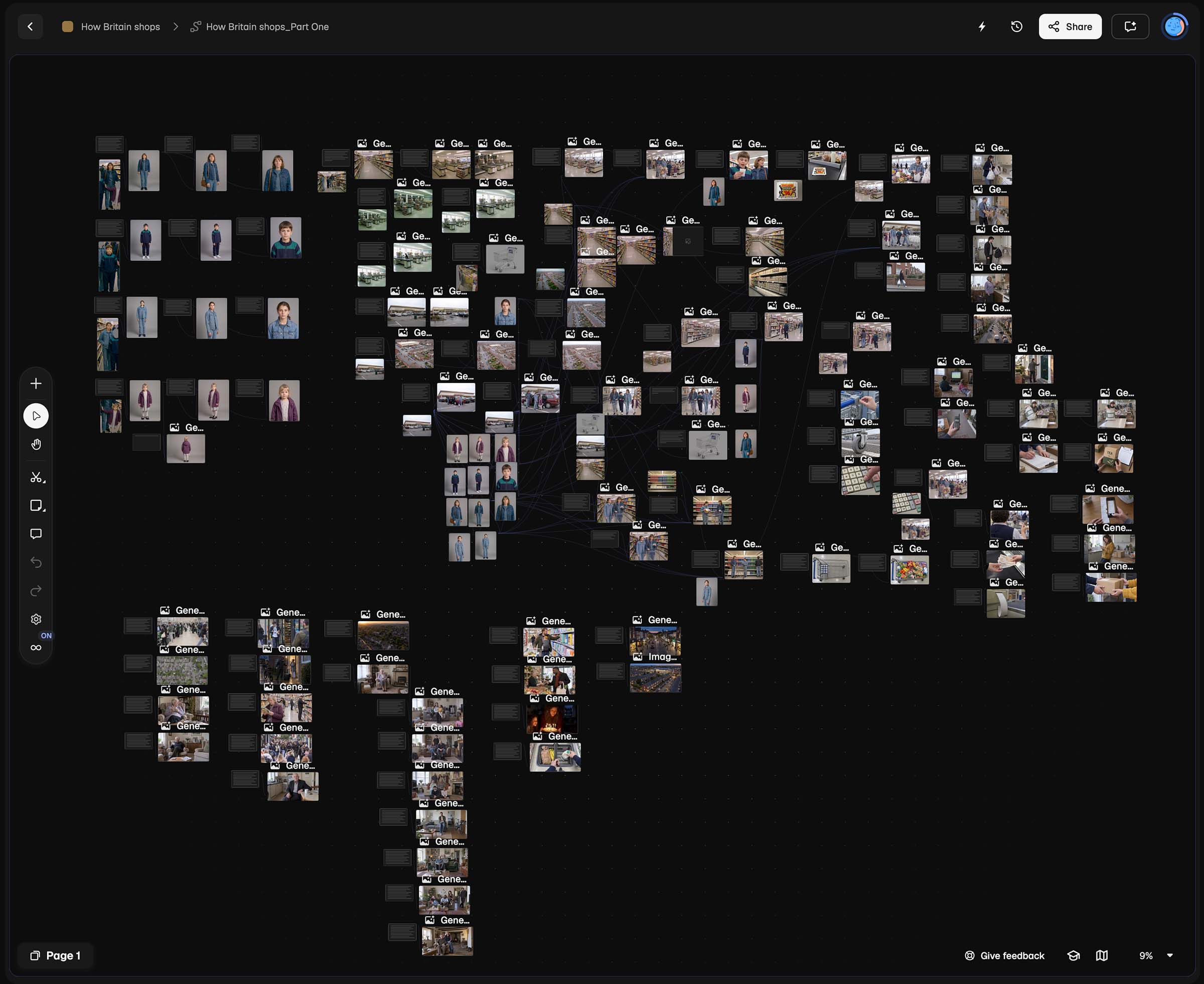
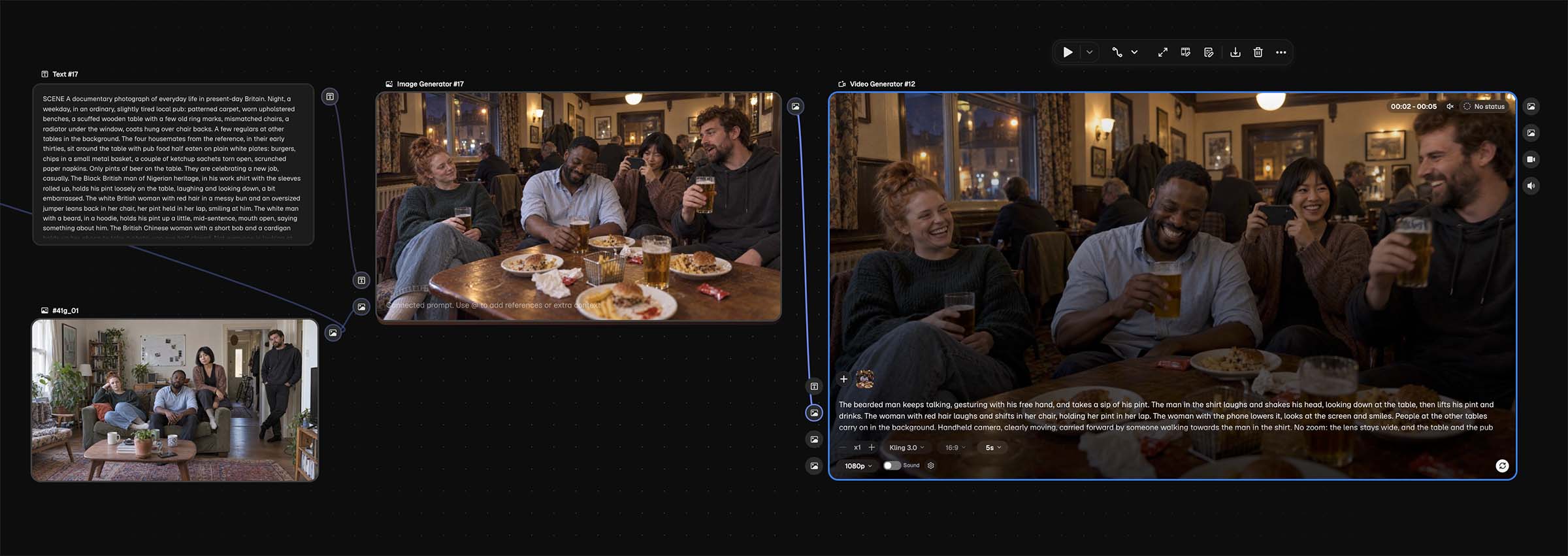
A typical shot worked like this. A text node held the prompt. It was connected to an image generator, which was also connected to the reference images: the character sheets and the location plates. Together, they produced the still. If something wasn’t right, we kept the same structure and changed only what we needed: the prompt, the model or the references. Then we generated again until the image was right.
For the video, we connected that still to a video generator as the start frame, and added the video prompt.
The whole path to every clip stays on the board. Weeks later, we could go back to any shot and change anything at any stage, without rebuilding it from scratch. When the client asked for a change, we knew exactly where to make it.
What 1996 taught us
Generating a film is not the same as generating a picture. These rules came out of the 1996 act, mostly learned the hard way.
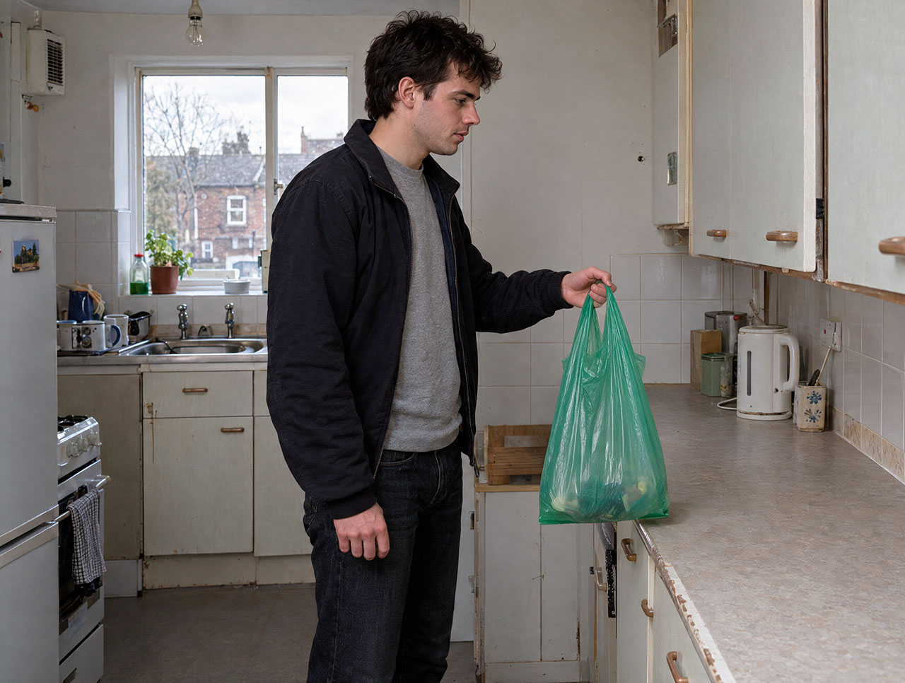
One moment per still. A still can only hold one instant. Anything that needs time belongs in the video prompt. We often designed the still backwards from the clip. For a man lifting shopping bags onto a kitchen worktop, we chose the moment halfway up, arms bent, bags at hip height. That gives the video model a movement to complete.
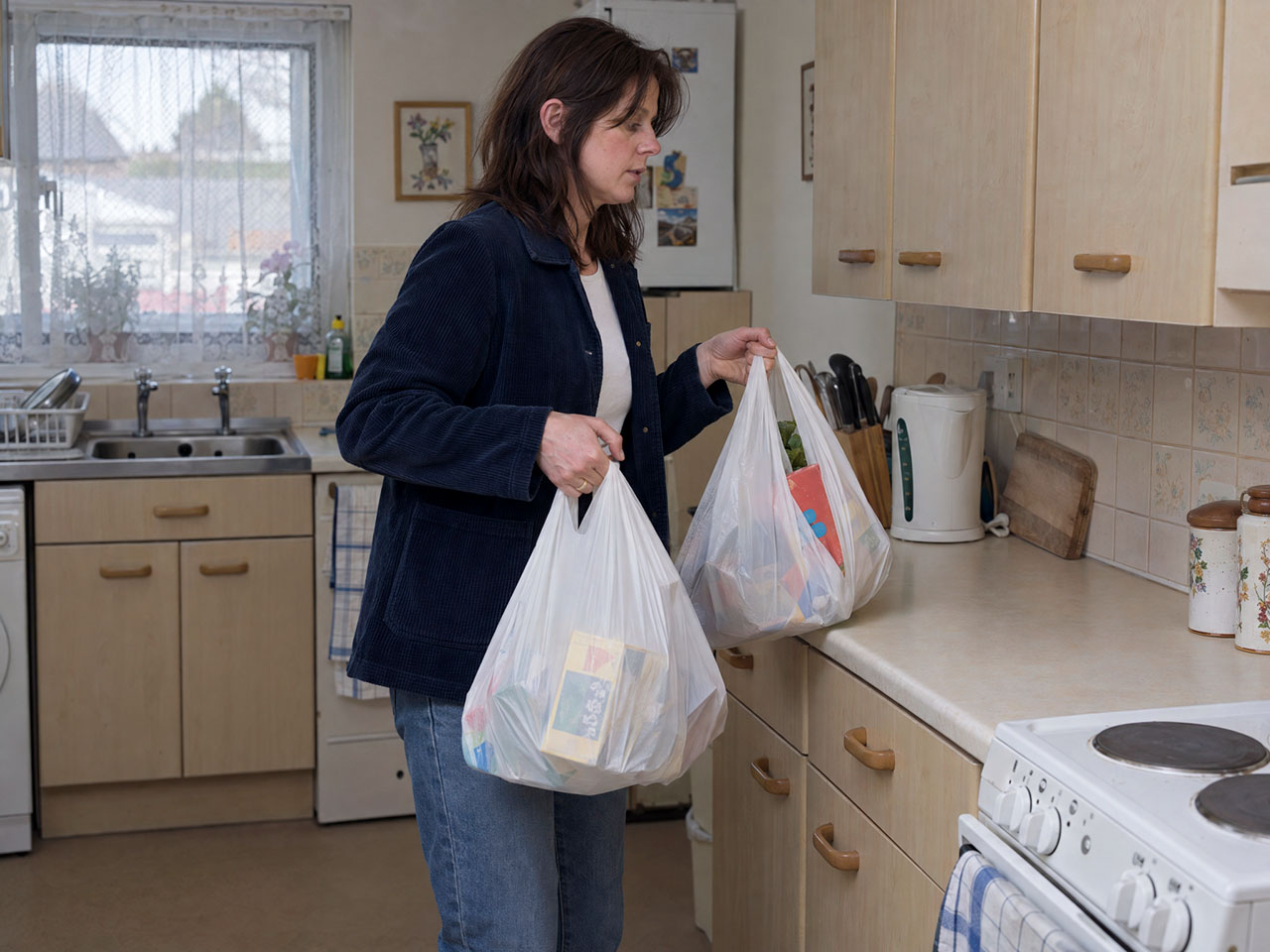
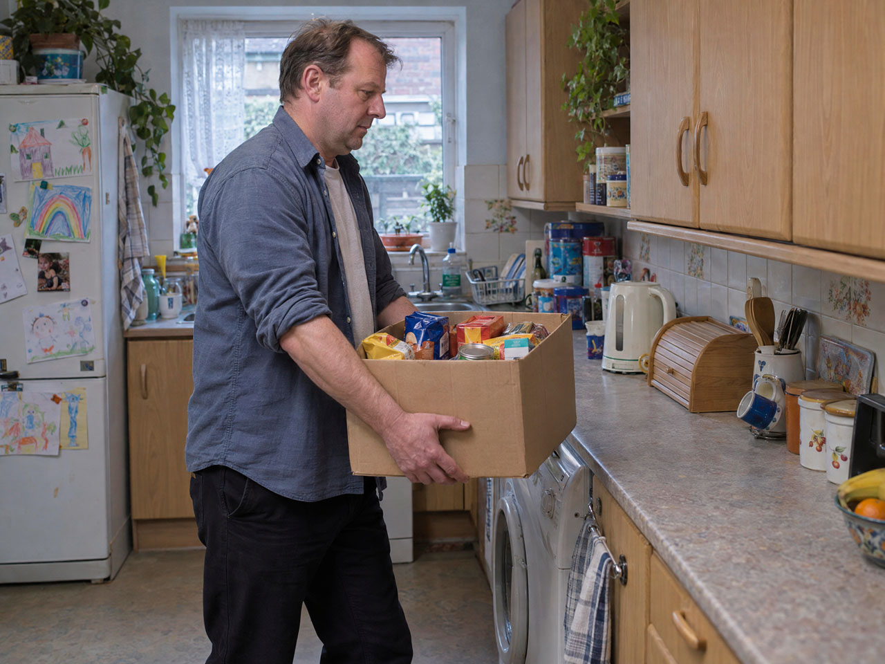
Describe behaviour, not emotion. Ask for “happy” and you get advertising faces, everyone smiling at the same time. So we stopped describing feelings and described what people do. The boy is talking. The teenager smiles at what he says. The little girl is looking at something else. Never everyone at the same level.
Describe the light, not the colour. We once asked for a checkout with “a faint green cast”. It came back bright green. When you name a colour, the model exaggerates it. Describe where the light comes from and how hard it is, and let the reference image carry the colour.
Catch everything at the still stage. Brands slip in all the time: a cola multipack in the mother’s hands, film cases on a living-room floor, logos on a television. In a still, you fix it in minutes. In a clip, there is no partial fix. You throw the whole clip away.
Keep the stills clean. The period lives in the clothes, the cars, the till and the packaging, not in the image quality. VHS texture and grain were added in the edit. If you put grain in a source frame, the video model tries to animate it.
Know when to stop. The banknotes in the cash shot never looked fully British to a British eye. With fingers across them, slightly soft, for a second on screen, they pass. Another ten generations would not have improved the film.
The first cut
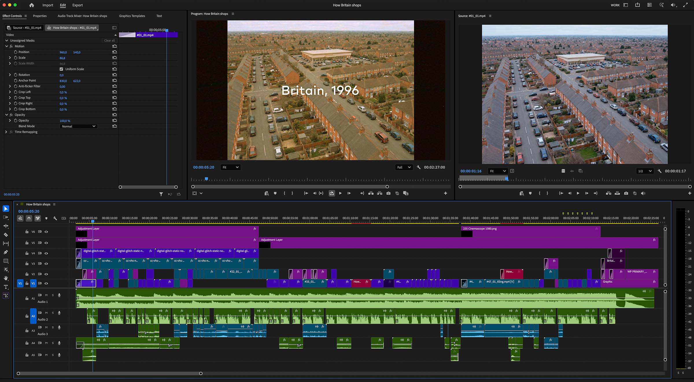
Every clip in the 1996 act was generated with AI. But the film itself was made where films have always been made: on a timeline, in Adobe Premiere Pro.
Generated clips are raw material. Sound design did a lot of the work the brief asked for: trolley wheels, till keys, the receipt printer. These sounds carry the period on their own. A few shots from the storyboard did not make it, simply for time. That is editing, and no model does it for you.
We sent the client the first act on its own. They loved it.
Why stop there?
The plan was to go back to stock and AI for the rest of the film. But once you can make exactly the image you have in mind, going back to whatever a library happens to have is hard. So we made the rest of the film with AI too.
A film that looks like Britain
One thing we loved about the generated images was how British they were. This film was for a British audience, in London, about how Britain shops. It had to be faithful to what Britain actually looks like.
Stock footage rarely is. Most of it is generic, and a lot of it is not British at all. Here we could ask for exactly what we needed: terraced streets running into semis, a meal deal from a convenience shop, a bunch of petrol-station flowers, a local pub with a patterned carpet. The finished film looks as British as it could. We could not have done that with stock.
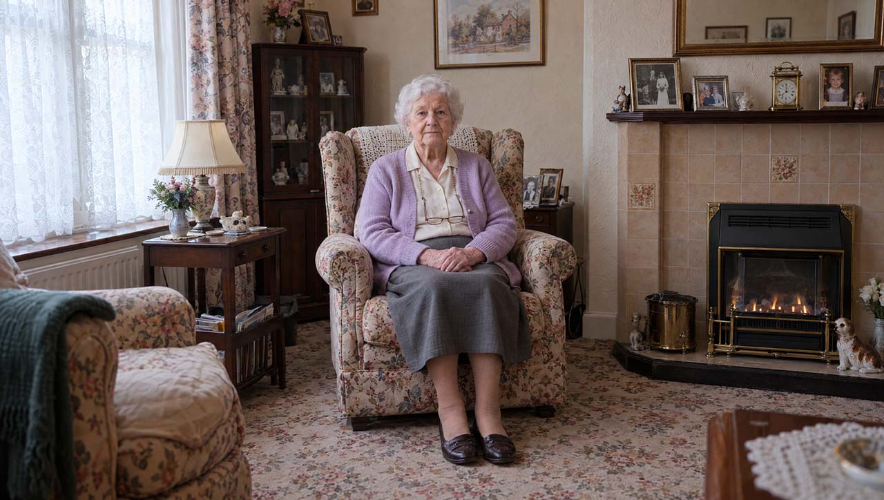
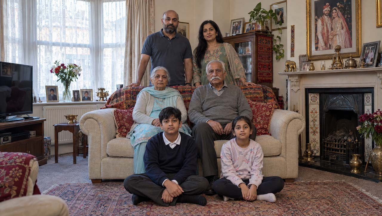
The clearest example is a sequence of eight household portraits, under the line “The total is only the headline. What matters is the composition underneath.”
A woman in her late seventies living alone. A single mother with two children. Three generations of one family. Four adults sharing a house. Each household poses at home, looking straight at camera.
These are not a stock library’s idea of a family. They are the kinds of households that actually make up Britain today, photographed at home the way a documentary photographer would. We also cast them to reflect the real mix of the British population: not uniform, and not so varied that it looks like a casting exercise.
The framing never changes: same lens, same height, same distance, same light. Only the household changes. That sameness is what makes it read like a portrait of a country, not a montage of different homes.
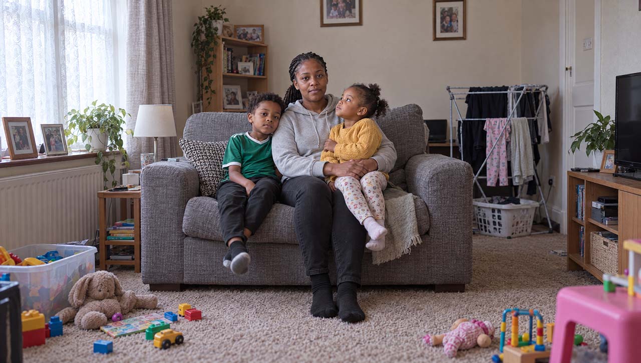
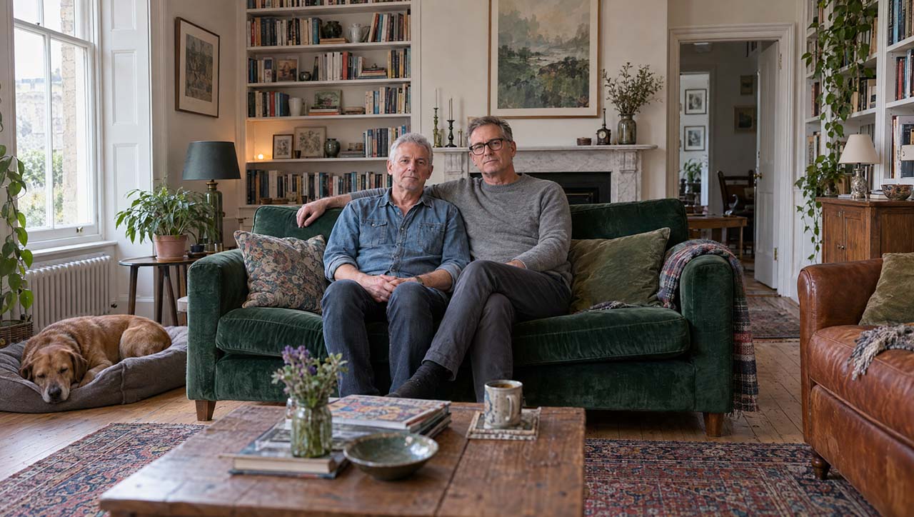
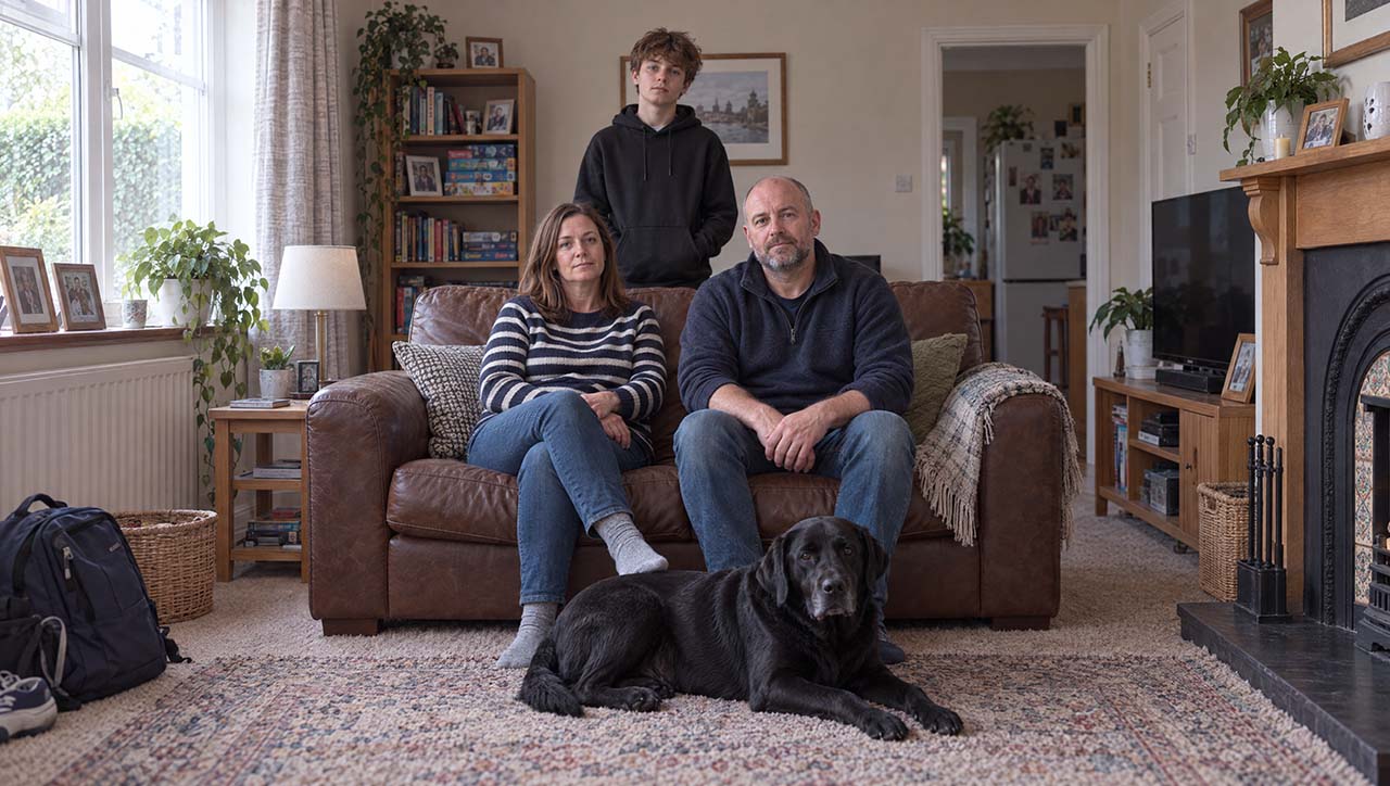
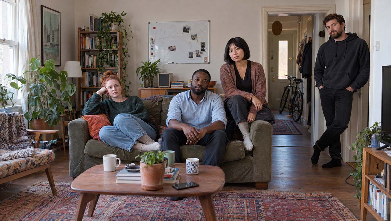
Near the end of the film, the same households come back, in motion. First posing, then living.
Directing, not just generating
The other big difference was control. We could direct the film. For each part, we chose the lens, the camera position and the movement, the same way we would on a shoot.
Two sequences near the end show this well.
Under the line “…combining our best methodologies to bring more households, trips and shopping missions into view, capturing around three times as many store visits”, we wanted to show people in shopping situations. We used static shots with a 50mm lens. A normal focal length, observing from a distance. The camera watches people shop.
The next line is different: “More real behaviour observed. More of the differences shaping demand brought into focus. A clearer view of where growth lies, and what to do next.” This is about real behaviour, how people actually live. So we went back to the same eight households, now at home around their meals, and moved to a 24mm lens. A wide lens lets the camera get close to people while still showing the room, as if we were there with them. The camera is handheld, slightly pushing in, to give a sense of life and change.
The very last shot breaks that pattern on purpose. After seven restless shots, an older woman in her front room, tea in both hands, looking out of the window. The camera moves on a slow, smooth dolly. Everything before it moves. She is still.
This is where film knowledge matters most. AI has made film production available to almost anyone. But the visual language is the same as it has always been. Cameras, lenses, movement, light. If you don’t know what a 24mm lens or a handheld camera does, you can’t ask for it.
But the models don’t always do what you ask. Once we found the right prompt for this sequence, the camera movement worked well for the first four or five shots. This was the prompt:
Handheld camera, clearly moving, carried forward by someone walking towards the table. No zoom: the lens stays wide, and the table and room shift in perspective as the camera gets closer.
Then it started to go wrong. The camera zoomed in instead of moving forward.
To most viewers that difference might seem small. But it isn’t. It’s exactly the kind of thing that makes a film stand out.
We changed the prompt in different ways, and it kept zooming. Our best guess is that something in the start frames for those shots pushed the model towards a zoom more strongly than the prompt pushed it away. But that is a guess. Nobody can see inside the model and tell you why.
This is the frustrating side of working with AI. You write something you think is completely clear, and the model does what it wants. In the end we got the movement we needed, but only after many generations and a lot of small changes.
The models give you stock
There is an irony here. We moved to AI to get away from stock footage. And the first thing the image models gave us was stock photography.
The present-day images came back well lit, well composed, and completely dead. Too perfect. The men looked like models. The light looked like HDR. These models learn from millions of images, and a lot of those images are stock. So stock is their default.
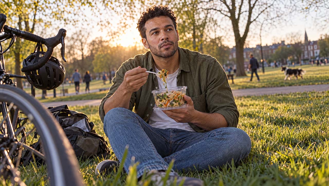
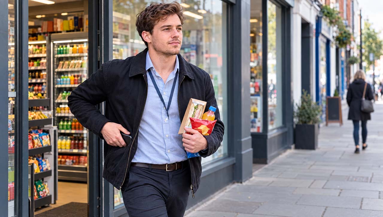
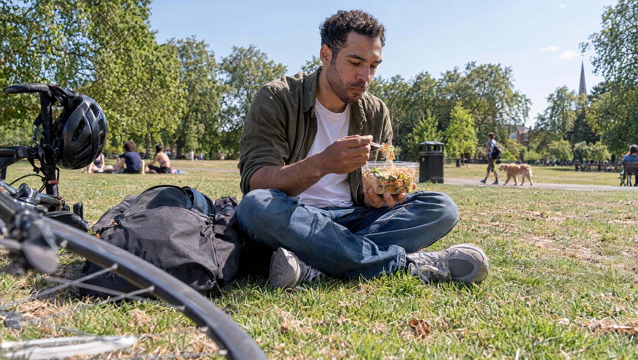
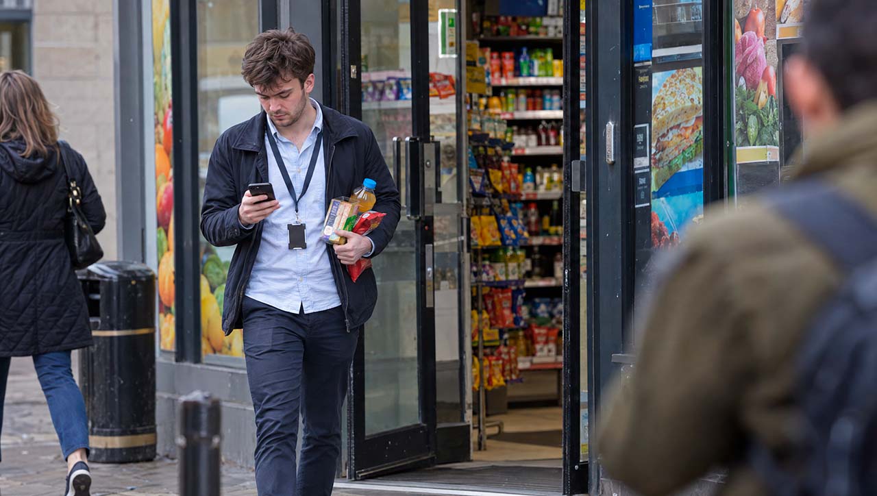
Getting away from it took most of the work in the present-day act. What helped, in order:
- Start with the frame, not the subject. Every prompt opened with “A documentary photograph of everyday life in present-day Britain.”
- Cast ordinary people. “An ordinary, unremarkable face.” “A slightly untidy haircut.” “Not a model.”
- Break the composition. Subject off-centre, someone cut by the edge of the frame, something out of focus in the foreground. A moment caught, not set up.
- Make the set untidy, in specific ways. Gaps on shelves, a box of stock half unpacked on the floor, a dropped receipt. “Make it messy” doesn’t work. Specific mess does.
- Limit the dynamic range. A real camera exposing for a bright sky can’t also hold a face in shadow. When an image holds both, it reads as fake. So we asked for the face to fall into shadow, as it would.
- Remove words that push too hard. “Golden hour” turned every image orange. Describing how the light falls worked better than naming the time of day.
The same people, in more places
The “three times the store visits” beat needed a visual idea. Showing more shoppers would only repeat the 30,000 to 55,000 households message on screen just before. So we brought back people the audience had already met, and showed each of them again in a different shop. The same people, seen more often, in more places. That is what three times the store visits means.
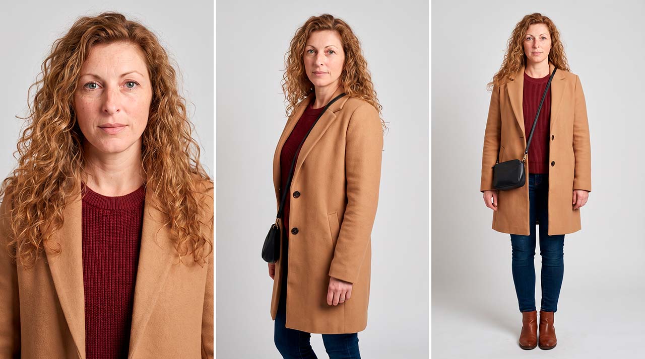
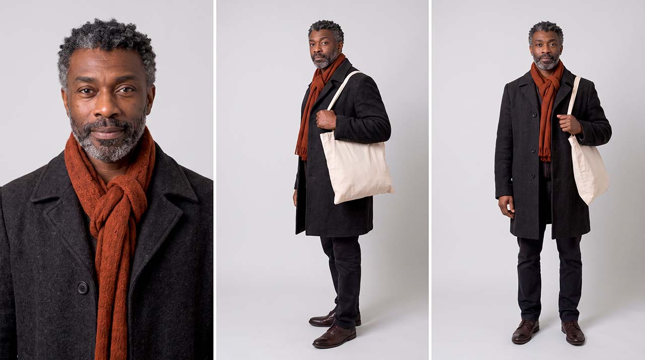
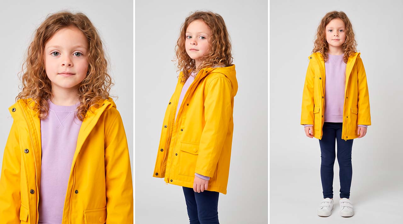
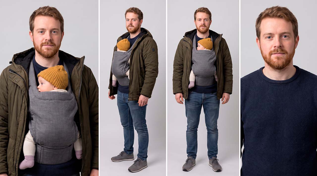
A dad with a baby on his chest, seen first in a supermarket, comes back in a convenience shop at night with a ready meal. A man from a greengrocer’s comes back at a staffed supermarket till with a full trolley, and again at a petrol station buying flowers. A mother and daughter come back in a discounter and in a health and beauty shop.
At about a second per shot, the audience has to recognise them instantly. So these characters got character sheets too, with clothing fixed as their main marker: a camel coat, a yellow raincoat, an olive jacket with a grey baby carrier and a mustard hat. At small sizes, clothes are how you recognise people.
What AI still can’t do
If you think AI can make anything now, try a fridge. A tall, white, ordinary fridge-freezer with one door open. We tried four times, with more detail each time. It came back with two doors, or one door belonging to two compartments, or the wrong size. In the end we kept the best version and moved on.
Some failures came from the prompt, not the model. One man was generated with three arms. The prompt had him leaning back on one hand while eating from a pot with a fork. That needs three hands, so the model gave him three. We now count the hands an action needs before we write it.
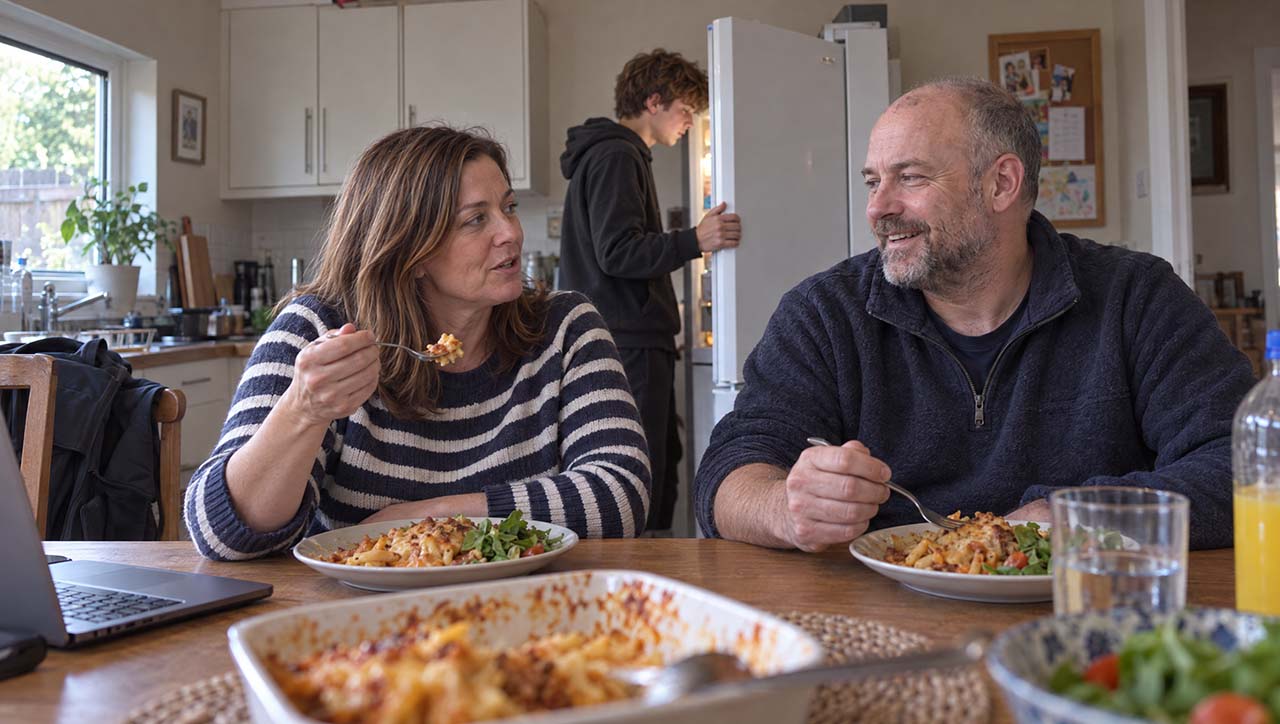
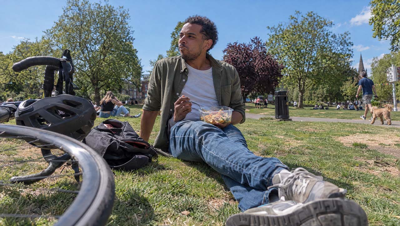
And some objects the model simply doesn’t know. A British shopping basket has two handles, one on each long side. The model kept giving it one.
Some shortcuts don’t work yet either. We tried to generate all eight household portraits in one go, as a single multi-shot clip in Kling 3.0. It promised to be fast.
The result was poor, and we lost control of framing, casting and consistency. So we went back to our slower method: eight separate stills, each animated with the same short prompt:
The people hold still and keep looking into the lens. They breathe naturally and blink. Small, involuntary movements only. Nobody speaks, smiles or waves. Static camera, locked off.
The slow way is slow because every step is a chance to correct something. That is the point of it.
Checking every frame
No real brands appear anywhere in the film. That was decided at the start. Keeping it that way took work on every single frame.
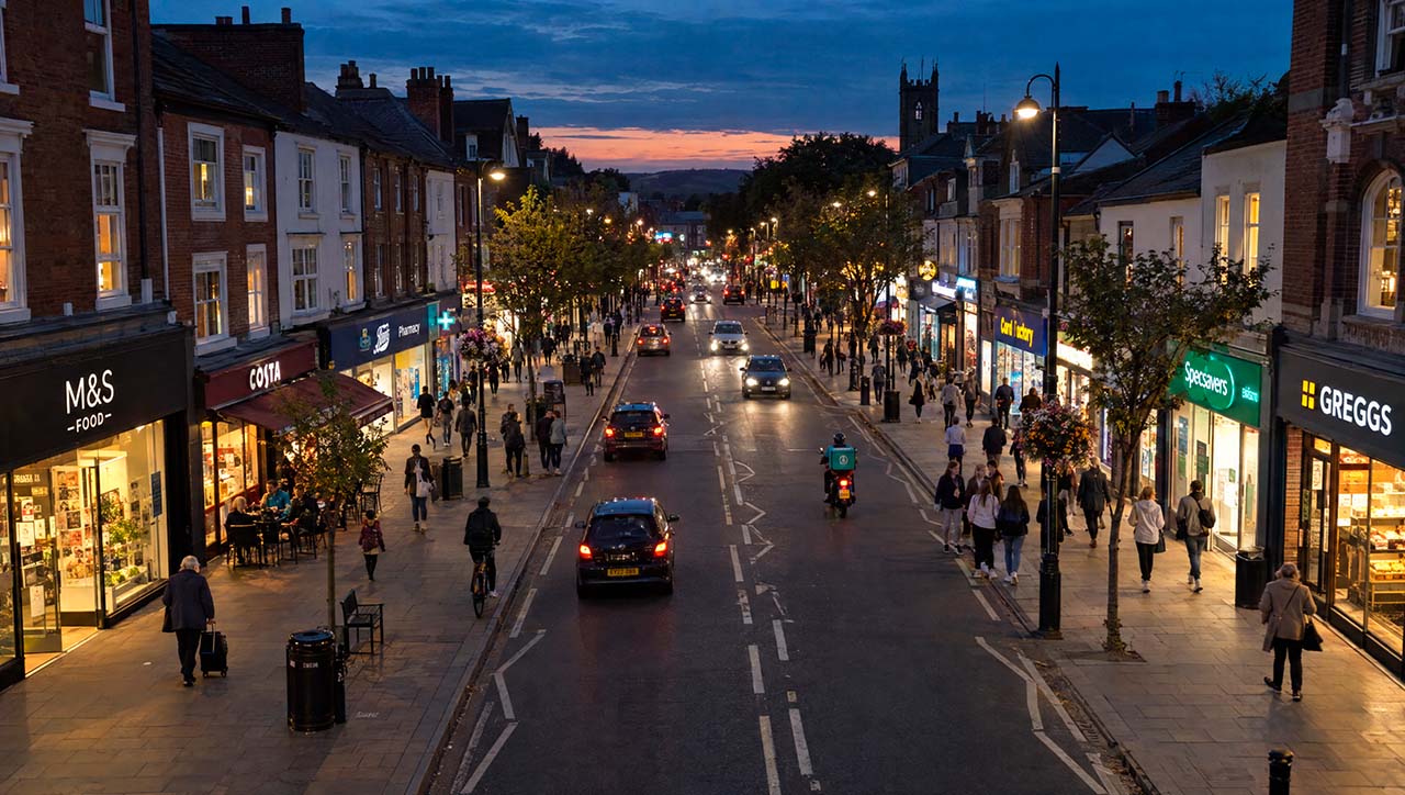
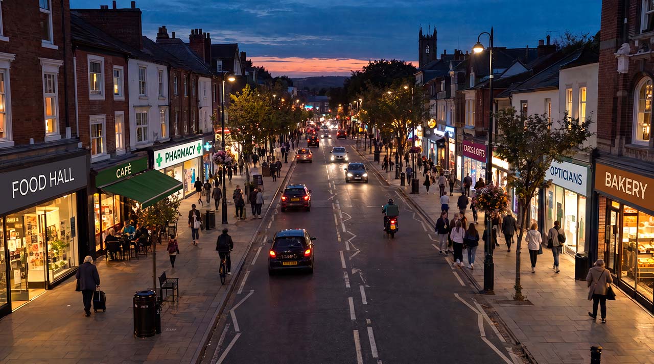
A drone shot of a high street at dusk came back with real shop signs along the whole street, all readable. We replaced each one with a plain generic word: FOOD HALL, CAFÉ, PHARMACY, BAKERY. Generic words, not invented names, because an invented name may belong to a real business somewhere, and models spell short common words more reliably.
Brands also come in without a logo. A box of dishwasher tablets came back in the exact colours of the market leader, in a category whose owner was on the guest list. We changed it to green and white. Discounter aisles could not be blue and yellow, or red and yellow.
What changed for us
For fifteen years, the question in our work for Worldpanel was “what can we find?”. On this film, the question became “what do we want to show?”.
AI didn’t make the work lighter. It made a different (and better) film possible.
With stock footage, we started from what existed. Worldpanel sent us the script. We searched the libraries for clips to match each line, and filled the gaps with whatever came closest. When the clip that should carry an idea didn’t exist, the film ended up with shots that took up time on screen without saying anything.
There was a second problem: coherence. Every stock clip comes from a different place. It was filmed at a different time, with a different camera and lens, by a different person, in different light. Putting twenty of those clips together and making them feel like one film is almost impossible. And it is not only about the look. It is also about culture. A film for a British audience needs to look like Britain, not like the US, Spain or the Middle East. Stock libraries rarely let you be that specific.
On this film, every shot came from the same photographic style, the same references and the same rules. It looks like one film because it was made as one film.
It also let us start from the idea. If the voiceover talked about how often people shop, we could show a basket with bread, bananas and a bottle of milk, and nothing else. If it talked about the same households seen more often, we could show the same people in different shops. Every shot could be there for a reason.
That is the real change for us. We no longer fill gaps. We build the film we have in mind.

